With the SFXC installation come some tools that allow inspection of the .cor files that the correlator outputs directly.
This, however, is not suitable for proper data quality assessment, and those .cor files cannot be distributed to a scientist: none of the viable VLBI Radio Data Processing systems (AIPS, CASA, Miriad, HOPS, …) can use the .cor files directly
This section explains how the workflow at JIVE addresses these issues.
jiveplot
At JIVE it was decided long ago (~1997, that was in the previous millenium) to use the AIPS++/CASA MeasurementSet v2 format (“MS”, “MSv2” hereafter) as internal data format.
The reasons for choosing it as “internal” data format were simple:
AIPS++ (former name of CASA, it’s complicated) data reduction package (DRP) at the timeAIPS++ had scripting language that give direct access to the data; none of the other data formats had that (no, not Python, Python had it’s v1.2 release in 1995 - and it definitely didn’t come with batteries included back then)AIPS++ project would be the VLBI DRP of choice … (it took until ~2019, a matter of time indeed)This decision, to use MeasurementSet as intermediate/internal data format has proven to be a very, very, good one. It has allowed JIVE to support multiple correlators, with equally different output data formats, each only having to provide code to decode the data format so it could be written out as MeasurementSet.
All other post-correlation workflow tools, which operate on the MeasurementSet directly, are, and have been, entirely agnostic about which correlator produced the data. Not bad!
As archival data product, which ends up in the EVN Archive and gets distributed to the scientists, the well-documented FITS-IDI format (“FITS-IDI”) was chosen.
The typical post-correlation workflow at JIVE can be summarized as follows:
In the following steps several tools will be needed. They need to be present on your post-correlation system. On the workshop cluster the compiled binaries will already have been installed for you, as documented below. The Python modules used in this document are not: because of Python3 package management strategies these have to be installed in a virtual environment of your own by yourself - also documented below.
jive-casa C/C++ compiled toolsThe jive-casa tools are absolutely necessary for the post-correlation workflow. If not available on the system, compiling from source is simple enough. However, before going there, test if the tool(s) are already on your system:
# Check if the tool is already available on your system,
# expect output similar to this.
$> j2ms2 --version
j2ms2: Version 1.0.6 git:master@95009aa
If not installed, the tools can be compiled from the following git repositories and following the build instructions therein. They’re all CMake-ified projects.
NOTE: may be installable throuh the system’s package manager (
apt-get,yum, …), YMMV:$> sudo {apt-get|yum|...} install casacore-dev
jiveplot MS plotting packageJIVE software engineers are much like software engineers elsewhere: if something doesn’t work, or is too slow, or is cumbersome - let’s write something different ourselves!
Visualizing data from a MeasurementSet has always been painful, and in the beginning non-existant even. Based upon the in-house developed not python application jivegui-ms2, eventually, when Python did become the scripting language of CASA, the jiveplot package got developed.
Because of Python3’s externally managed package installation (e.g. through apt, yum or what have you) the jiveplot package needs to be installed in a virtual environment (“venv”). Fortunately, these days that’s reasonably simple:
# Create a directory where multiple virtual environments can be created
$> mkdir ${HOME}/venvs
$> cd ${HOME}/venvs

# Each "venv" is identified by a name,
# choose something descriptive, e.g. 'jiveplot'
$> python3 -m venv jiveplot
Now the “venv” is created. But a “venv” must be activated before your system actually uses the “venv”.
The command to activate (or switch to) a specific “venv” in the current shell is as follows:
# Note the leading '. ' (dot and space)
$> . ${HOME}/venvs/jiveplot/bin/activate
Or substitute jiveplot with the name of the venv of your choice.
Within the activated (jiveplot) venv, installing the jiveplot Python package should be as easy as:
$> pip3 install jiveplot
The package is published on the Python Package Index (PyPI) here
The SFXC correlator control file determines where the correlator generates outputs and how to name the output file(s). For the post-correlation workflow it is important that the file names end in .cor.
It is recommended to, if not already done through the automated tooling, to organise the experiment folder and output and VEX file as indicated here:
/path/to/EXPERIMENT/
               ├─ EXPERIMENT.vix
               ├─ <EXPERIMENT>_<SCANx>.cor
               └─ <EXPERIMENT>_<SCANy>.cor
At JIVE, where an experiment is correlated in multiple independent jobs, the experiment folder is laid out like this:
/path/to/EXPERIMENT/
               ├─ EXPERIMENT.vix
               ├─ <JOBx>
                     ├─ <EXPERIMENT>_<SCANx>.cor
                     └─ <EXPERIMENT>_<SCANy>.cor
               ├─ <JOBy>
                     ├─ <EXPERIMENT>_<SCANz>.cor
                     └─ <EXPERIMENT>_<SCANi>.cor
If the VEX-file isn’t named like the directory it is in, a simple symbolic link will fix that readily:
$> ln -s some_file_name.vix EXPERIMENT.vix
Assuming the data is gathered in an EXPERIMENT-specific folder as described under gather data, and your environment is set up the conversion to MeasurementSet is done using the j2ms2 (jay to em es too) tool.
Depending on how the data is organised in the EXPERIMENT directory, translating SFXC Correlator data to a MeasurementSet called “EXPERIMENT.ms” is as simple as:
# All `.cor` files in EXPERIMENT directory
# (Or be explicit in exactly which one(s) to translate)
$> j2ms2 -o EXPERIMENT.ms *.cor

# ... or, when having subjobs
# (Here it does all correlator data from all subjobs,
#  but it is possible to be explicit by naming the `.cor`
#  files to be translated individually)
$> j2ms2 -o EXPERIMENT.ms */*.cor
This will append the specifed .cor’s data to EXPERIMENT.ms, creating it if it doesn’t exist.
If an error occurs about “not being able to find subband information” - please check the mixed bandwidth note below first.
Notes:
- if
EXPERIMENT.msalready exists, all data specified on thej2ms2command line will be appended to that MS. Usually this is desirable behaviour, but please see the notes onj2ms2- the name of the MS is rather immaterial, for demonstration purposes it is always
EXPERIMENT.msbut theEXPERIMENTpart in this documentation is to be interpreted as placeholder.
A special mention needs to go out to “mixed bandwidth” correlation. Many stations in the EVN observe with different channel/IF/spectral window bandwidths. The scheduler takes care that for example one 64 MHz band of station X overlaps with 2 x 32 MHz bands of station Y - otherwise correlation would be impossible.
Because the VEX file is organised per station this means there are different frequency setups in the VEX file. E.g. setup_64MHz for station X and setup_32MHzx2 for station Y.
At correlation time this is usually fixed by assigning (or creating) a specific station’s frequency setup as “how it’s correlated”. In the example here: the experiment will be correlated as 2 x 32 MHz bands - i.e. in the setup_32MHzx1 mode.
j2ms2 cannot by itself know how the data was correlated in a case like this. Its default behaviour is to take the first frequency configuration of the first station it finds in the VEX file. A sensible default, but, in some cases, totally the wrong one, leading to a cryptic error message such as:
As the j2ms2 documentation explains, the following command line option can be used to instruct j2ms2 to use station Y’s frequency configuration:
$> j2ms2 eo:setup_ref_station=Y [options] *.cor
jiveplotBefore blindly throwing data reduction software at the data, it is recommended to do some data quality assessments. At JIVE the jiveplot package is used to create diagnostic plots from the raw data in a MeasurementSet.
For interferometric data a number of “standard plots” can tell “did the correlation actually work?”, and summarise the data visually for quick inspection if any issues with the downstream data reduction can be foreseen.
The SFXC correlator produces complex spectra as output by default, and that is what ends up in the MeasurementSet. One complex spectrum per baseline, per source, per subband, per polarisation per integration time. In other words: even a small MS will contain a lot of spectra.
In this section the jplotter command line interface (the “jcli”) (from the jiveplot project) will be used to create those ‘standard diagnostic plots’. It features very short commands to type in (but they are ‘mnemonics’, mostly).
The focus of
jplotteris on speedy and interactive plotting in favour of readability. In this section the “jcli” commands that can be typed at the prompt are rendered in boldface.In the
jiveplotrepository exists a colourful PDF that explains the high-level ideas behindjplotter. It might help having that open for browsing whilst going through the steps below.
After having your environment set up, the “jcli” can be entered:
# for reasons, the program is called `jplotter`, not jiveplot, sorry
# it will drop you into the jplotter command line interface ('jcli')
$> jplotter
+++++++++++++++++++++ Welcome to cli +++++++++++++++++++
$Id: command.py,v 1.16 2015-11-04 13:30:10 jive_cc Exp $
  'exit' exits, 'list' lists, 'help' helps
jcli>
Feel free to see what help and list do.
Hint: help without arguments provides an overview of all commands with a one-line summary of what they do, providing some inspiration.
Use the built-in help <command> to have <command> explained in (too?) much detail, e.g. about ‘mini languages’ that help easing the data selection.
According to the jiveplot’s README.md the 5-second workflow is like this:
# open a m(easurement) s(et) using the "ms" command
jcli> ms /path/to/folder/file.ms

# (optional) select which data to plot
...

# select a p(lot) t(ype) using "pt <plottype>"
# l(ist) p(lottypes) ("lp") to see what's available
jcli> lp
...
jcli> pt <plottype>

# And ... pl(ot)
jcli> pl
jcli has a notion of “current working directory”. It is possible to navigate / inspect the file system using the standard UNIX commands cd, ls and pwd:
# Should feature TAB-completion (if all is well)
jcli> cd /path/to/folder

# normal ls command
jcli> ls -d *.ms
file.ms

# Unsurprising!
jcli> pwd
/path/to/folder
One of the simplest diagnostics to check is checking the weights that the correlator has assigned to each complex spectrum. The weight is a floating point number $0 \leq \text{weight} \leq 1$, where $\text{weight} = 0$ implies no valid samples at all went into the resulting spectrum, and $\text{weight} = 1$ meaning perfect data - not a sample was lost computing that spectrum.
# assumes a MeasurementSet was already opened.
# select p(lot) t(ype) w(eight-versus-)t(ime)
jcli> pt wt

# just give it a go; pl(ot) all data and see what happens
jcli> pl
Most likely this plots way too much information. If more than one page of plots is generated (see top right meta data in the plot) you can navigate through them using commands to jump to f(irst), l(ast), the [nth]n(ext) or [nth]p(revious) page ([nth] is an optional positive integer, default = $1$). Or enter i(interactive) mode, where left/right mouse clicks do p(revious)/n(ext), but typing the flnp characters also works (if the plot window has the focus)
See the colourful PDF, sections “11. Multi window/batch support, …, navigating pages of plots” under the i, f, l (&cet.) section
As for the plethora if data points plotted, it helps realising that the weight on a cross-baseline “XY” is computed from the weights of the individual antennae forming the baseline. Those weights are taken from the antennae’s auto-correlation spectra, the ‘0-baseline’ “XX” and “YY”. In fact, that extends to the cross-polarization products too: the RL/LR weights are formed by combining the baseline input’s individual “X/R”, “X/L”, “Y/R”, “Y/L” polarization weights.
Armed with this knowledge, together with jplotter’s data set agnostic data selection mechanisms allows plotting only the relevant weights:
# only select the auto baselines
jcli> bl auto

# for each subband/spectral window ('*'), select only the p(arallel) polarizations
# the 'fq' command allows selecting subband(s) out of the f(requency) g(roups) (=frequency setups, configurations)
# see "help fq" for an explanation
jcli> fq */p

# and regenerate the pl(ot)
jcli> pl
# the default 'point' symbol does not scale with point size
# PGPLOT symbol #17 does
# (see "help symbol" for more info)
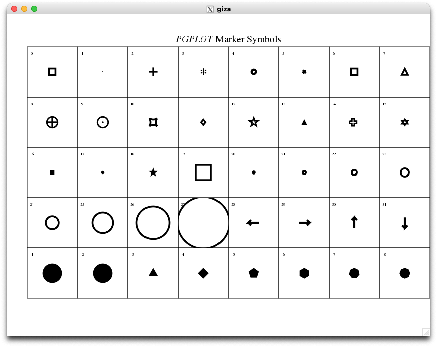
jcli> symbol unflagged=17
# set bigger (p)oin(t) (s)i(z)e
jcli> ptsz 1.2
# and (pl)ot again
jcli> pl
Refer to PGPLOT symbols for an overview of the available PGPLOT symbols.
It is very insightful to inspect the amplitude of the complex spectra versus frequency response of the individual antennas. This is also called the “bandpass”. It shows (local) RFI signals, polarization- or subband related issues, or e.g. receiver gain fall off when observing near the edge of the receiver’s usable frequency range.
For these plots again only the auto baselines are used, but the cross-polarization plots have a good use case here. They’ll show e.g. if a polarization is swapped, or if a station is using a linearly polarized receiver whilst others employ circular polarized receivers.
# again assumes a measurement set is opened
# make sure auto baselines are selected
jcli> bl auto

# select p(lot) t(ype) amp(litude-versus-)freq(uency)
pt ampfreq

# select all polarization products (=the default) of all subbands ('*')
jcli> fq *

# and regenerate the pl(ot)
jcli> pl
Now this produces a lot of plots! That is because each integration is plotted as individual spectrum! This has several drawbacks:
For this type of data it makes sense to av(erage) in t(ime) (avt command) to address both issues: we get less data points and higher signal-to-noise. Because it’s ‘only’ the amplitude we’re interested in here, we want scalar averaging:
jcli> avt scalar

jcli> pl
jplotter supports several ways of “how to integrate in time”, determined by the solint setting:
Understanding the differences (and power) of the options please refer to, in decreasing order of importance (and increasing level of complexity): help solint, then help indexr (very lightweight), help scan (this one ranges from “trivial” to “OMG head explodes”), to help time.
NOTE: At any point in time it is possible to review
- the current data s(e)l(ection) indicating which data you’ve selected; a selection of “none” $\Rightarrow$ “everything”,
- the current p(lot) p(roperties) like p(oin)t s(i)z(e), line w(idth), and layout of nxy panels (in the x- and y- direction, columns and rows), averaging settings, & more
jcli> sl
...
jcli> pp
...
Each spectral point in the data is a complex number, i.e. having an amplitude and a phase - or differently said: it’s vector-like. When a number of spectral points are to be averaged - be it in time or frequency (or both) - it depends on the quantity (‘amplitude’ or ‘phase’) that needs to be extracted if the complex vectors first need to be averaged (‘vector averaging’), or if the quantity can be averaged (‘scalar’).
The mathematical difference can be expressed as:
$ \text{Scalar average of Quantity} = \frac{\sum_i^n \text{Quantity(data[i])}}{n}$
$ \text{Vector average of Quantity} = \text{Quantity(} \sum_i^n \text{data[i]} \text{)}$
where $\text{Quantity(…}$ is a function returning a real-valued property of the data point $\text{data[i]}$, e.g. it’s phase, amplitude, real or imaginary part, and $\sum_i^n \text{data[i]}$ is the complex summation.
With a lot of data comes messy plotting on the screen - baselines, polarizations, sources, subbands/IFs, … by default in no particular order.
jplotter has some default layouts per p(lot) t(type):
The layout in terms of panels (columns x rows) can be set using the nxy command. jplotter supports fixed and flexible layouts. Depending on the actual number of plots that need to be displayed, jiveplot can flexibly change the layout to fit all plots on the whole screen. When adjusting the actual layout jplotter takes the hint from the actual nxy setting which dimension (columns or rows) is preferred and stretches that one. If the layout is fixed, well, it is fixed, irrespective of how many plots are actually drawn.
# arrange for eight panels: 4 columns x 2 rows
# the default is "flexible" - allow stretching if < 8 plots
jcli> nxy 4 2

# ... or set a fixed layout
jcli> nxy 1 8 fixed
Even with the layout, the order of the data is still indeterministic: it is plotted in the order in which it is found in the MeasurementSet. The sort command allows the panels to be sorted on the labels for p(olarization), s(u)b(band), ch(annel), b(ase)l(ine), s(ou)rc(e), time, if they appear in the panel title
Please refer to the colourful PDF, sections “5. What’s on screen” and “6. Oh my label!” (both on p.5), and “10. Tinkering with the layout, … etc.” (p.10)
Another diagnostic to look at is phase of the complex cross-correlation spectra as function of frequency. If there is a ‘fringe’ between two stations, this shows as a well-behaved/well-defined phase-versus-frequency relation. Sometimes it can highlight issues in the equipment - e.g. the phase between different pieces of hardware not being connected. This can be calibrated out (as long as it’s stable), but sometimes it is a sign that some piece of equipment is synchronized differently than others.
As with the “Amplitude versus frequency” plots, this requires averaging for the most useful results - but this time avt vector is needed: the quantity of interest is the phase of the averaged complex number (not the average of the phases of the complex numbers - see scalar or vector averaging).
It may be relevant to decide how the time averaging is to be performed. Collapsing all timeseries into one phase per baseline, subband, and polarization would average out any details. A usable approach is to select ~10s worth of data out of a calibrator scan. Using the scan based selection, for example from the colourful PDF, section “8. Scan-based data selection”.
The number of baselines in a data set can grow large quickly. Therefore usually only the baselines to a known-good and/or sensitive reference station are inspected; the other baselines are combinations between them (much like how the selection for the weight plot was narrowed down to only the relevant weights). The b(ase)l(ine) (bl) command can be used to very efficiently select those in a way that works on any measurement set (see also help bl).
Summing it all up:
# select the p(lot) t(ype) pha(se vs )freq(uency)
jcli> pt phafreq

# now we want to look at the cross-baselines to a reference antenna
# the r(ange) command with argument ant(enna) shows the antenna names in the data set.
# pick one. (hint: the correct answer is 'Ef', nearly always)
jcli> r ant
...

# select all baselines to the chosen reference antenna
# do not forget to remove the auto baseline of refant with itself :-)
jcli> bl <refant> -auto

# see above
jcli> avt vector

# Run indexr, if not already done
#jcli> indexr
# Check the list of scans to locate scan of interest
# remember the scan number
jcli> listr
...

# Snazzy scan-based data selection!
jcli> scan mid - 5s to mid + 5s where scan_number = <selected-scan-number>

# and pl(ot) again
jcli> pl
NOTE: the plot properties (colours, line widths, layout, &cet.) are kept per plot type. Changing to a different plot type may mean re-setting some of the p(lot) p(roperties).
This has both advantages and disadvantages. For now
jplotterleans towards it having slightly more advantages than disadvantages, but motivated GitHub issues are welcome!
This is a very insightful diagnostic plot. When plotted over the whole experiment it shows the long-term amplitude stability as well as the slow-changing (if everything is working fine) phase over time.
For this plot the amplitude and phase of a “channel” (a frequency point) is tracked over time. But, as above, a single frequency channel’s behaviour over time is noisy, and therefore doesn’t contain much signal. As seen in the phase across the band plots, if everything is working, there is a reasonable well-defined behaviour of the phase versus frequency (or channel).
To increase the signal of a single spectrum channel averaging, using the av(erage) c(hannel) (avc) command can be used. Like the avt command there is a choice of scalar and vector. Since the phase across the band needs to be collapsed into a single value, vector averaging must be used.
It is not wise to average all spectral channels of a subband. Looking at the bandpass plots it can be seen that the lowest and highest channels in the subband contain little or no signal: the amplitude drops to ~0. This is due to the fact that the VLBI equipment uses a bandpass filter to isolate the requested subband frequencies out of the sky signal.
A rule of thumb sais the inner 80% of the band should contain usable signal. Therefore we need to sub-select these channels out of each subband. jplotter has a convenient data selection that allows doing this irrespective of actual number of spectral channels in the data set, using the ch(annel) command. See help ch for a brief explanation.
Putting it all together, to produce this diagnostic plot, the following steps are needed:
# select p(lot) t(ype) **a**(mplitude a)**n**(d )**p**(hase vs )**time**
jcli> pt anptime

# remove any existing time selection - in principle the whole experiment should be plotted
jcli> time none

# again, only cross-baselines to a reference antanna are useful
jcli> bl <refant> -auto

# Nifty 80%-of-the-subband selection mechanism, works on every data set
jcli> ch 0.1*last:0.9*last

# time averaging? don't do that!
jcli> avt none

# channel averaging? yes please, the vector flavour
jcli> avc vector

# and pl(ot) again
jcli> pl
NOTE:
jplotterby default gives each plot the same x/y - axis scale, allowing for direct comparison of the dataIn a plot like this, where it’s likely that due to the different amplitude responses on the different baselines, a lot of detail could be missed: one very strong baseline will “push down” the signals in the other baseline plots
Using the y0 command, each plot can be given it’s own y-axis scale:
jcli> y0 local
See also help y (and help x) for explantion and more options.
So far only spectra and derived quantities have been plotted. But the easiest way to see if the correlation actually worked, is to look at THE FRINGE! This topic, whilst highly interesting, has been left as the last because … it requires creating a different measurement set!
The j2ms2 tool, introduced under Translate to Measurement Set, allows for the visibilities computed by the SFXC correlator to be written out in the ‘LAG’ (or ‘time’) domain. The MeasurementSet has support for this natively, but not many tools do. jplotter does.)
Add the -d time command line option to the j2ms2 command and change the output MS name, usually adding a “-lag” somewhere to indicate it’s ‘LAG’ data:
$> cd /path/to/EXPERIMENT
$> j2ms2 -d time -o EXPERIMENT-lag.ms *.cor
...
To display THE FRINGE, it’s basically a time-averaged amp(litude versus )chan(el) plot on the cross-baselines for a useful time range. Select a scan, or part of a (calibrator) scan, using the mechanism(s) illustrated above.
# open the just created m(easurement) s(et)
# this automatically clears any data selection!
jcli> ms EXPERIMENT-lag.ms

# reset plot properties
jcli> reset

# select p(lot) t(ype) amp(litude versus )chan(nel)
jcli> pt ampchan

# only cross baselines to a reference antenna
jcli> bl <refant> -auto

# select all p(arallel) hand polarization products from all ('*') subbands
jcli> fq */p

# select a time range, scan, or part of scan
# (the first minute of the experiment here - who knows)
jcli> time $start to +1m

# average "the fringe" in time
# it's only an amplitude, so scalar averaging is OK
jcli> avt scalar

# I think we're good to go!
jcli> pl
The jive-casa toolbox comes with two programs:
j2ms2 for correlator output $\rightarrow$ MeasurementSet formattConvert for MeasurementSet $\rightarrow$ FITS-IDI formatIf the correlated data cannot usefully be processed using CASA, or other tools that operate on MeasurmentSet, or inspected using jiveplot, then maybe exporting to FITS-IDI format is a last resort.
The basic use should be literally as simple as this, provide the input MS name and a desired FITS-IDI output file name:
$> tConvert <input-ms> <output-fits-file>
Unless the <input-ms> was created in a bizarre way - e.g. mixing data from different experiments, or from different correlator setups - the process should Just Work™. The key issue to be aware of is that the MeasurementSet format allows much more than what can be represented in FITS-IDI format. tConvert does all kinds of checks on <input-ms> to verify that in principle the translation can be done.
See the full tConvert documentation for all intricate details and slightly more advanced use cases that tConvert supports.
Content built by Marjolein Verkouter.
Built with ♥ — Markdown + HTML + CSS + Prism.js + a bit of AI + Jack Radcliffe (2025)